
TL;DR
- Use
<a class="au lu" href="https://developer.android.com/reference/kotlin/androidx/compose/ui/text/PlatformTextStyle" target="_blank" rel="noopener ugc nofollow"><em class="lg">PlatformTextStyle</em></a>compatibility API from<a class="au lu" href="https://android-developers.googleblog.com/2022/05/whats-new-in-jetpack-compose.html" target="_blank" rel="noopener ugc nofollow"><em class="lg">Compose 1.2.0 beta</em></a>to configure<a class="au lu" href="https://developer.android.com/reference/kotlin/androidx/compose/ui/text/PlatformParagraphStyle#includeFontPadding()" target="_blank" rel="noopener ugc nofollow"><em class="lg">includeFontPadding</em></a> - For now,
<em class="lg">includeFontPadding</em>is true by default in Compose but it will be changed to false in the next releases of Compose, and eventually the compatibility API will be removed. - Test your UI using
<em class="lg">includeFontPadding</em>set to<em class="lg">false</em>and make any necessary adjustments. - Use
<a class="au lu" href="https://developer.android.com/reference/kotlin/androidx/compose/ui/text/style/LineHeightStyle" target="_blank" rel="noopener ugc nofollow"><em class="lg">LineHeightStyle</em></a>API to match your designs easier.
Creating Jetpack Compose, our new UI toolkit, from the ground up gave us the chance to re-evaluate choices made in the past. In this blog post, we’ll dive into the details of text alignment in both the View system and in Compose. You’ll learn more about the changes we’re making to font padding which will make text rendering more fault-proof and help you implement designs easier from common designer tools like Figma or Sketch.
From our partners:
While migrating to the new APIs has plenty of benefits it could also mean slight design inconsistencies, and/or breaking changes in your automated screenshot testing. But not to worry! We will show you how you can start using these APIs and begin testing your text today, migrating at the pace that’s most convenient for your app.
Font padding in the View system
<a class="au lu" href="https://developer.android.com/reference/android/widget/TextView#attr_android:includeFontPadding" target="_blank" rel="noopener ugc nofollow">includeFontPadding</a> is a <a class="au lu" href="https://developer.android.com/reference/android/widget/TextView" target="_blank" rel="noopener ugc nofollow">TextView</a> parameter that effectively controls the line height of the first and last line in a text. Typically, turning it on will make the first and last line taller by adding vertical padding.
The default value is true and you can override it as follows:
/* Copyright 2022 Google LLC.
SPDX-License-Identifier: Apache-2.0 */

<TextView
   android:id="@+id/hola_mundo"
   android:text="@string/hola_mundo"
   . . .
   android:includeFontPadding="false"
/>
If we take a look at the following example:
When includeFontPadding is false, the line height of the first and last line is equal to (descent — ascent).
When includeFontPadding is true is where it gets interesting:
- Line height of the first line is equal to (descent — top).
- Line height of the last line is equal to (bottom — ascent).
- If there is only 1 line, the line height is equal to (bottom — top).
- For inner lines, their line height is always equal to (descent — ascent).
Top, ascent, and descent are examples of font metrics. These metrics provide information about a font that allows the system to evenly space and uniformly align lines of text. They are constant per font, and you can retrieve them by using the <a class="au lu" href="https://developer.android.com/reference/android/graphics/Paint.FontMetrics" target="_blank" rel="noopener ugc nofollow">FontMetrics</a> API or a tool like ttx.
Setting includeFontPadding to true or false can impact how text is aligned in its parent container, and lead to subtle differences in alignment.
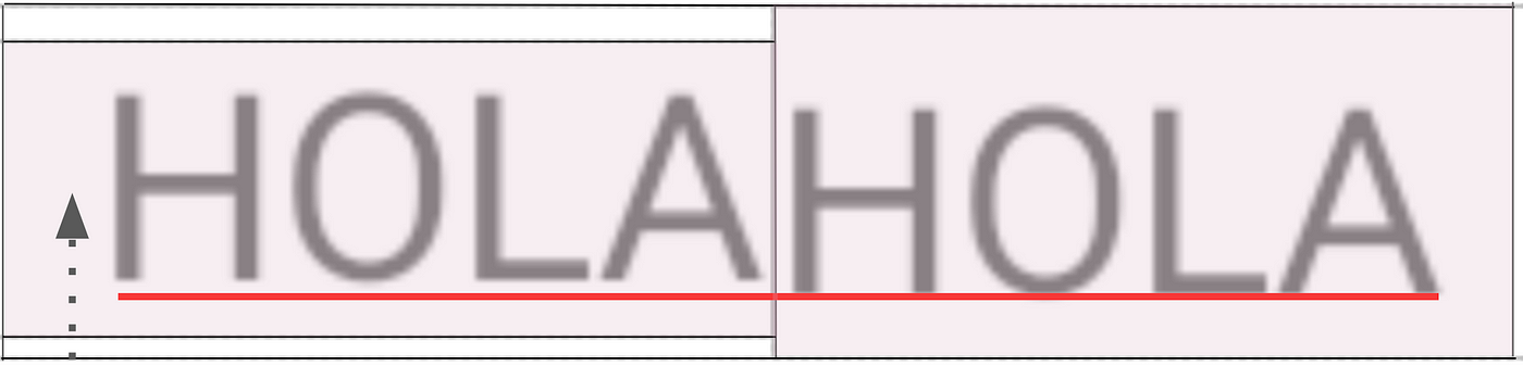
includeFontPadding is false to the left and true to the right.
It might sound like having includeFontPadding configured as true by default might be the opposite of what you’d want. If you need to follow specific design guidelines, having extra padding in your text could make this harder to achieve. The reasoning behind including this padding by default is historical.
Background
Roboto is the standard typeface and the default font (or first font in the system font fallback) on the Android platform.
To calculate the maximum amount of space available to draw a font, the system, up until Android 27, made these calculations using Roboto’s font metrics. It decided on the amount of available space and considered this space the “safe space to draw” the text.
This solution did not work for all fonts, as fonts with designs or “scripts” that are typically taller than Latin text were “clipped”. Clipping means that part of the glyphs (or characters) would not be entirely visible on the available draw space. Throughout this article we’ll use Burmese as an example of a tall script. A sample text in Burmese is ၇ဤဩဦနိ.
This is where <strong class="kk jm">includeFontPadding</strong> was introduced, to prevent tall scripts from getting clipped, allowing you to add a top and bottom padding to the text.
We can see the behavior in this example:
<em class="nn">includeFontPadding</em> is false to the left (notice Burmese font clipping, and the white background color due to no added padding) and includeFontPadding and true to the right (Android API 25)So, if you’ve ever set includeFontPadding to false, and your app supports Burmese language, it might face font clipping issues depending on your Android version.
Setting includeFontPadding to false
There are some valid use cases for setting includeFontPadding to false, for example, to solve vertical alignment issues or to comply with specific design specs.
Let’s see two examples:
When centering text in a parent widget, for example a button, text can be expected to be centered vertically.
The horizontal bar in H is expected to be vertically centered. However, when includeFontPadding is true, this alignment would depend on the font and its font metrics. Let’s see what happens with a font that has more padding at the top than at the bottom:
In this example, includeFontPadding is false on the left and true on the right. Notice the vertical alignment is slightly off on the right due to the uneven font padding. Depending on the font and the text used (for instance lowercase Latin text would naturally sit closer to the lower part of the draw space), this difference could be more obvious.
Another example is where text has to be aligned to the top or bottom of another view, for example an image. Because of the extra padding added by includeFontPadding, the text and image are not aligned. Let’s take a look at the desired design:

Usually to achieve the above result you would use a combination of setting includeFontPadding to false plus hardcoding some padding.
Fixes for the View system
The TextView widget is built on top of two foundational Java classes, <a class="au lu" href="https://developer.android.com/reference/android/text/StaticLayout" target="_blank" rel="noopener ugc nofollow">StaticLayout</a> and <a class="au lu" href="https://developer.android.com/reference/android/text/BoringLayout#BoringLayout" target="_blank" rel="noopener ugc nofollow">BoringLayout</a>, and delegates into one or the other depending on the nature of the text to display on the screen.
Starting with devices running Android 28 and above, we added <a class="au lu" href="https://developer.android.com/reference/android/text/StaticLayout.Builder#setUseLineSpacingFromFallbacks(boolean)" target="_blank" rel="noopener ugc nofollow">useLineSpacingFromFallbacks</a> functionality to <a class="au lu" href="https://developer.android.com/reference/android/text/StaticLayout" target="_blank" rel="noopener ugc nofollow">StaticLayout</a>, so the ascent/descent of the text will be adjusted based on the used font instead of Roboto’s font metrics. When set to true, this configuration fixes the font clipping issue even if includeFontPadding is false. And it prevents consecutive lines running into each other which includeFontPadding wasn’t solving.
However this feature wasn’t added to <a class="au lu" href="https://developer.android.com/reference/android/text/BoringLayout#BoringLayout" target="_blank" rel="noopener ugc nofollow">BoringLayout</a> (text on a single line, left-to-right characters) at that time. For this scenario, there could still be clipping. Support for this has been added recently, and will come out with Android T.
From API 33,
includeFontPaddingbecomes redundant forTextViewfor the original purpose it was designed, because clipping issues will be automatically handled. Until your minSdk is 33, you still need to set<strong class="kk jm">includeFontPadding</strong>true in the View system to prevent font clipping for tall scripts.
includeFontPadding is used in combination with <a class="au lu" href="https://developer.android.com/reference/android/widget/TextView#attr_android:fallbackLineSpacing" target="_blank" rel="noopener ugc nofollow">fallbackLineSpacing</a> but also <a class="au lu" href="https://developer.android.com/reference/android/widget/TextView#attr_android:elegantTextHeight" target="_blank" rel="noopener ugc nofollow">elegantTextHeight</a>. The combination of these two parameters results in complex behaviors.
To add to the flexibility (but also to the confusion), TextView also allows you to configure <a class="au lu" href="https://developer.android.com/reference/android/widget/TextView#attr_android:firstBaselineToTopHeight" target="_blank" rel="noopener ugc nofollow">firstBaselineToTopHeight</a> and <a class="au lu" href="https://developer.android.com/reference/android/widget/TextView#attr_android:lastBaselineToBottomHeight" target="_blank" rel="noopener ugc nofollow">lastBaselineToBottomHeight</a> which helps define additional padding in the top and bottom text line respectively. These attributes are only applied in API level 28 and higher.
Multiple parameters allow you to modify font padding in a
TextView, they can interact in complex ways, and behavior might vary between API levels. Always make sure to test your View-based UI against various API levels.
Implementation in Compose
When building the initial <a class="au lu" href="https://developer.android.com/reference/kotlin/androidx/compose/material/package-summary#Text(kotlin.String,androidx.compose.ui.Modifier,androidx.compose.ui.graphics.Color,androidx.compose.ui.unit.TextUnit,androidx.compose.ui.text.font.FontStyle,androidx.compose.ui.text.font.FontWeight,androidx.compose.ui.text.font.FontFamily,androidx.compose.ui.unit.TextUnit,androidx.compose.ui.text.style.TextDecoration,androidx.compose.ui.text.style.TextAlign,androidx.compose.ui.unit.TextUnit,androidx.compose.ui.text.style.TextOverflow,kotlin.Boolean,kotlin.Int,kotlin.Function1,androidx.compose.ui.text.TextStyle)" target="_blank" rel="noopener ugc nofollow">Text</a> implementation in Compose, the behavior was aligned with <a class="au lu" href="https://developer.android.com/reference/android/widget/TextView" target="_blank" rel="noopener ugc nofollow">TextView</a>’s behavior, adding font padding by default in Compose’s <a class="au lu" href="https://source.corp.google.com/androidx-platform-dev/text/text/src/main/java/androidx/compose/ui/text/android/TextLayout.kt?q=DEFAULT_INCLUDE_PADDING" target="_blank" rel="noopener ugc nofollow">TextLayout</a>.
However, it didn’t expose a parameter to turn this padding on and off.
The community was very quick to point this out, by creating a bug related to View parity which earned a lot of attention. The request was to allow turning includeFontPadding on and off when using the Text composable function, like in the View system.
While thinking how to implement this toggle feature in Compose, we analyzed how includeFontPadding is used and the main use cases it was solving. We knew that text should just render as expected and that includeFontPadding is a very Android specific configuration and should not be on the common API. It is a confusing parameter overall and very error prone (it exposes an API that is hard to understand, hard to explain, and works only for a subset of specific cases).
We had the following goals:
- Removing unnecessary paddings, giving the control back to you to implement the paddings you really need.
- Automatically preventing clipping issues for tall scripts, italic fonts, etc.
So we released changes that included:
- Creating a new API
<a class="au lu" href="https://developer.android.com/reference/kotlin/androidx/compose/ui/text/PlatformTextStyle" target="_blank" rel="noopener ugc nofollow">PlatformTextStyle</a>to allow to switch<a class="au lu" href="https://developer.android.com/reference/kotlin/androidx/compose/ui/text/PlatformParagraphStyle#includeFontPadding()" target="_blank" rel="noopener ugc nofollow">includeFontPadding</a>on and off (default value is true). - To fix all tall fonts clipping issues that could happen from turning
includeFontPaddingoff in Compose, we apply additional padding when required for only the first and last line, and the max line height is calculated based on the font(s) that is used for all the text included in a given line (instead of theFontMetricsof the first font in the font fallback). - We’ve applied a solution that works for all versions of Android until API 21 (the min SDK level required to use Jetpack Compose libraries).
If you’re interested in taking a closer look at the implementation of our solution, check out the following change lists:
first change, adding additional padding automatically
with this change we added temporary compatibility configuration forincludeFontPaddingin TextStyle/ParagraphStyle
follow up change, keepingincludeFontPaddingtrue by default in Compose
PlatformTextStyle API
As part of Compose 1.2.0-alpha07, we exposed an API in <a class="au lu" href="https://developer.android.com/reference/kotlin/androidx/compose/ui/text/TextStyle" target="_blank" rel="noopener ugc nofollow">TextStyle</a>/<a class="au lu" href="https://developer.android.com/reference/kotlin/androidx/compose/ui/text/PlatformTextStyle" target="_blank" rel="noopener ugc nofollow">PlatformTextStyle</a> that allows you to toggle includeFontPadding on and off. The default value is true, meaning font padding is added.
The API is marked as experimental/deprecated and is only for compatibility purposes. As you configure your texts with includeFontPadding switched to false and adjust your layouts if required, we intend to change includeFontPadding default value to false in upcoming releases of Compose, and eventually remove the compatibility API.
You can configure this in each Text in particular, so the migration is progressive:
/* Copyright 2022 Google LLC.
SPDX-License-Identifier: Apache-2.0 */

@OptIn(ExperimentalTextApi::class)
/* ... */

Text(
 text = myText,
 style = TextStyle(
   lineHeight = 2.5.em,
   platformStyle = PlatformTextStyle(
     includeFontPadding = false
   )
   /* ... */
  )
)
Or more generically on your typography:
/* Copyright 2022 Google LLC.
SPDX-License-Identifier: Apache-2.0 */

@OptIn(ExperimentalTextApi::class)
val Typography = Typography(
   body1 = TextStyle(
       fontFamily = /* ... */,
       fontSize = /* ... */,
       platformStyle = PlatformTextStyle(
           includeFontPadding = false
       )
   /* ... */
   )

MaterialTheme(
   typography = Typography,
   /* ... */
)
As these APIs are experimental, you’ll need to annotate the usages with <a class="au lu" href="https://developer.android.com/reference/kotlin/androidx/compose/ui/text/ExperimentalTextApi" target="_blank" rel="noopener ugc nofollow">ExperimentalTextApi</a> annotation.
Alternatively, if you’re building with Gradle, you can add the following exception to the kotlinOptions in your app’s build.gradle file:
kotlinOptions {
    ...
    freeCompilerArgs += ["-Xuse-experimental=androidx.compose.ui.text.ExperimentalTextApi"]
}
LineHeightStyle API
As we keep evaluating the impact of our changes, we listened to community’s feedback and developed an API to help you match your designs easier for text in your Compose app.
In 2019 Figma, a designer tool, announced that they made changes to how they measure and apply line height. In short, Figma distributed the line height just like the web in general does: 50/50 on top and bottom. Many designers and developers have been chatting to us about this blog post since.
In March 2022, a developer posted an article on how to have Figma behavior in Compose, as it doesn’t work out of the box.
<a class="au lu" href="https://developer.android.com/reference/kotlin/androidx/compose/ui/text/TextStyle#lineHeight()" target="_blank" rel="noopener ugc nofollow">LineHeight</a> is not a new concept for Compose Text, however there is more we can do to make displaying text easier and cover for most use cases presented by these different design tools.
Considering this background plus the changes we were already making, we committed to the following goals:
- Line height will be applied even for single line text
- Provide a way to have an even distribution of line height between above baseline and below baseline (like text in Figma)
- Provide a way to have additional line height to above baseline or below baseline (a use case such as how line height works in text in Google Docs)
- Provide a way for the developer to enable or disable the addition of line height at the top and bottom of the text
We created a more flexible API that allows you to customize line height behavior, giving you more control over the displayed text.
With the changes in this changelist, we added <a class="au lu" href="https://developer.android.com/reference/kotlin/androidx/compose/ui/text/style/LineHeightStyle" target="_blank" rel="noopener ugc nofollow">LineHeightStyle</a> (previously named LineHeightBehavior) to the existing <a class="au lu" href="https://www.google.com/search?q=TextStyle+refdocs+android&sxsrf=ALiCzsbuw7AdDBK8NclLqYUE1QLrJiD_Tg%3A1653481430764&ei=1h-OYp-eLo3zgQb5pZWwBw&ved=0ahUKEwif4cqq0vr3AhWNecAKHflSBXYQ4dUDCA4&uact=5&oq=TextStyle+refdocs+android&gs_lcp=Cgdnd3Mtd2l6EAMyBwghEAoQoAEyBwghEAoQoAE6BwgAEEcQsAM6BQghEKABSgQIQRgASgQIRhgAUDBYqAZgxwdoAXABeAGAAZQBiAHTB5IBAzIuNpgBAKABAcgBCMABAQ&sclient=gws-wiz" target="_blank" rel="noopener ugc nofollow">TextStyle</a> and <a class="au lu" href="https://developer.android.com/reference/kotlin/androidx/compose/ui/text/ParagraphStyle" target="_blank" rel="noopener ugc nofollow">ParagraphStyle</a>.
LineHeightStyle controls whether line height is applied to the top of the first line and to the bottom of the last line. It also defines the alignment of lines in the space provided by TextStyle(lineHeight). It’s a new API that offers several options to be able to modify your text’s behavior within the available draw space.
You can configure LineHeightStyle as follows:
/* Copyright 2022 Google LLC.
SPDX-License-Identifier: Apache-2.0 */

@OptIn(ExperimentalTextApi::class)
/* ... */

Text(
       text = "Hi",
       style = LocalTextStyle.current.merge(
           TextStyle(
               lineHeight = 2.5.em,
               platformStyle = PlatformTextStyle(
                   includeFontPadding = false
               ),
               lineHeightStyle = LineHeightStyle(
                   alignment = LineHeightStyle.Alignment.Center,
                   trim = LineHeightStyle.Trim.None
               )
           )
       )
   )
}
Note: We recommend defining <em class="lg">TextStyle</em> by using the <a class="au lu" href="https://developer.android.com/reference/kotlin/androidx/wear/compose/material/package-summary#LocalTextStyle()" target="_blank" rel="noopener ugc nofollow"><em class="lg">LocalTextStyle</em></a> merger, because failing to do will make you lose your Material theme’s styles. You can check the discussion around this in this feature request.
<a class="au lu" href="https://developer.android.com/reference/kotlin/androidx/compose/ui/text/style/LineHeightStyle.Alignment" target="_blank" rel="noopener ugc nofollow">LineHeightStyle.Alignment</a> defines how to align the line in the space provided by the line height. Let’s see an example using LineHeightStyle.Alignment.Top vs LineHeightStyle.Alignment.Bottom:
On the other hand, <a class="au lu" href="https://developer.android.com/reference/kotlin/androidx/compose/ui/text/style/LineHeightStyle.Trim" target="_blank" rel="noopener ugc nofollow">LineHeightStyle.Trim</a> options will allow you to remove or keep extra padding from the top of the first line and the bottom of the last line. For example, this is what the text would look like with LineHeightStyle.Trim configured as None vs Both:
Note: The configuration is applied only when a line height is defined on the text.
<a class="au lu" href="https://developer.android.com/reference/kotlin/androidx/compose/ui/text/style/LineHeightStyle#trim()" target="_blank" rel="noopener ugc nofollow"><em class="lg">trim</em></a> feature is available only when <a class="au lu" href="https://developer.android.com/reference/kotlin/androidx/compose/ui/text/PlatformParagraphStyle#includeFontPadding()" target="_blank" rel="noopener ugc nofollow"><em class="lg">PlatformParagraphStyle.includeFontPadding</em></a> is false.
includeFontPadding together with lineHeight and LineHeightStyle (Alignment and Trim configurations) result in multiple combinations that allow you to better align and style your Text in any given font. Make sure you check out the documentation for the relevant classes we introduced above, to explore the options that help you best match your designs.
Conclusion
Compose 1.2.0 beta is out, and the Compose equivalent to includeFontPadding is enabled by default with the possibility to turn it off, and start adjusting and testing your Text today.
While the PlatformTextStyle compatibility API (which allows you to disable includeFontPadding) will remain available in future releases, we aim to change the default behavior to being off by default soon. You can start using it to test your screens and make all necessary adjustments if they are required.
Additionally we’ve added the LineHeightStyle API with multiple options, another highly requested feature, that will help you match your designs easier.
If you experience issues/bugs while turning includeFontPadding off, please let us know and file a bug on our issue tracker.
Any further questions? Drop a comment below or reach out to me on Twitter, we’d love to hear from you!
Happy composing! 👋
This post was written with the collaboration of Seigo Nonaka, Sean McQuillan, Siyamed Sinir and Anastasia Soboleva on the Jetpack Compose Text team. Special thanks to Jolanda Verhoef and Florina Muntenescu on the DevRel team for their ideas and review.
By Alejandra Stamato
Source Medium
For enquiries, product placements, sponsorships, and collaborations, connect with us at [email protected]. We'd love to hear from you!
Our humans need coffee too! Your support is highly appreciated, thank you!