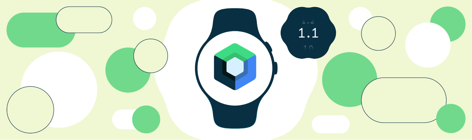
Today we’re releasing version 1.1 of Compose for Wear OS, our modern declarative UI toolkit to help developers build beautiful, responsive apps for Wear OS.
Since the first stable release earlier this year, we have seen many developers taking advantage of the powerful tools and intuitive APIs to make building their app simpler and more efficient. Todoist and Outdooractive are some of the developers that rebuilt their Wear apps with Compose and accelerated the delivery of a new, functional user experience.
From our partners:
Todoist increased its growth rate by 50% since rebuilding their app for Wear 3 and Outdooractive reduced development time by 30% and saw a significant boost in developer productivity and better design/developer collaboration:
“Compose makes the UI code more intuitive to write and read, allowing us to prototype faster in the design phase and also collaborate better on the code. What would have taken us days now takes us hours.”
The Compose for Wear OS 1.1 release contains new features and brings improvements to existing components, focusing on UX and accessibility. We’ve already updated our samples, codelab, and Horologist libraries to work with Compose for Wear OS 1.1.
New features and APIs
The Compose for Wear OS 1.1 release includes the following new functionality (baseline profiles already added for new components):
Outlined style for Chips and Buttons
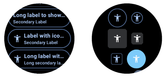 |
| OutlinedChip and OutlinedButton composables |
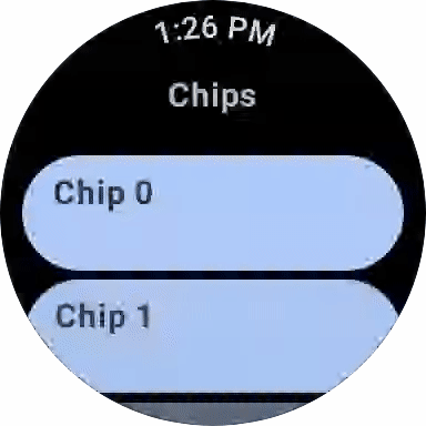
Modifying Chip and Button shapes
Starting from version 1.1, you can also modify shapes for Chip/ToggleChip and Button/ToggleButton components using new functions overloads.
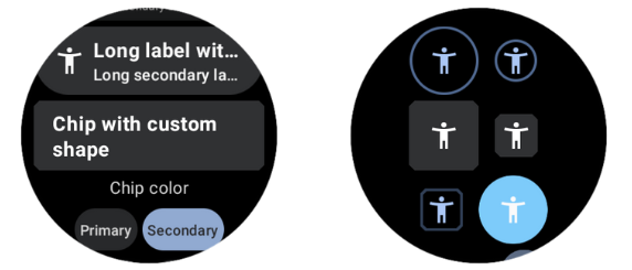 |
| Different Chip and Button shapes |
Placeholder API
A new experimental API has been added to implement placeholder support. This can be used to achieve three distinct visual effects separately or all together:
- A placeholder background brush effect used in containers such as Chip and Cards to draw over the normal background when waiting for content to load.
- A Modifier.placeholder() to draw a stadium shaped placeholder widget over the top of content that is being loaded.
- A Modifier.placeholderShimmer() for gradient/shimmer effect that is drawn over the top of the other effects to indicate to users that the current state is waiting for data to load.
 |
| Placeholder API usage examples |
Check out the reference docs and sample in Horologist to see how to apply the placeholder to common use cases, such as a Chip with icon and a label that puts placeholder over individual content slots and draws a placeholder shimmer on top while waiting for data to load.
Modifier.scrollAway
Horologist’s fadeAway modifier has been graduated to scrollAway modifier in version 1.1. Modifier.scrollAway scrolls an item vertically in and out of view, based on the scroll state, and already has overloads to work with Column, LazyColumn and ScalingLazyColumn.
 |
| ScrollAway modifier usage with TimeText |
Additional parameters in CurvedTextStyle
CurvedTextStyle now supports additional parameters (fontFamily, fontWeight, fontStyle, fontSynthesis) to specify font details when creating a curved text style. Extended curved text style can be used on both curvedText and basicCurvedText.
 |
| Applying different font to curved text |
UX and accessibility improvements
The 1.1 release also focuses on bringing a refined user experience, improvements for TalkBack support and overall better accessibility:
- ToggleChip and SplitToggleChip support usage of animated toggle controls (Checkbox, Switch and RadioButton) that can be used instead of the static icons provided by ToggleChipDefaults.
- Default gradient colors for Chip/ToggleChip and Cards were adjusted to match the latest UX specification.
- Updated a number of the default colors in the MaterialTheme to improve accessibility as the original colors did not have sufficient contrast.
- Accessibility improvements to Picker so that multi-picker screens are navigable with screen readers and the content description is accessible.
- InlineSlider and Stepper now have button roles, so that TalkBack can recognize them as buttons.
- The PositionIndicator in Scaffold is now positioned and sized so that it only takes the space needed. This is useful when semantic information is added to it, so TalkBack gets the correct bounds of the PositionIndicator on screen.
It’s time ⌚ to bring your app to the wrist!
Get started
To begin developing with Compose for Wear OS, get started with hands-on experience trying our codelab, and make sure to check out the documentation and samples. Visit Compose for Wear OS release notes for full list of changes available in version 1.1.
Note that using version 1.1 of Compose for Wear OS requires using the version 1.3 of androidx.compose libraries and therefore Kotlin 1.7.10. Check out the Compose to Kotlin Compatibility Map for more information.
Provide feedback
Compose for Wear OS continues to evolve with the features you’ve been asking for. Please do continue providing us feedback on the issue tracker and join Kotlin Slack #compose-wear channel to connect with the Google team and dev community.
We’re excited to see a growing number of apps using Compose for Wear OS in production, and we’re grateful for all issues and requests that help us to make the toolkit better!
Start building for Wear OS now
Discover even more with technical sessions from the Android Dev Summit providing guidance on app architecture, testing, handling rotary input, and verticalized sessions for media and fitness.
By Kseniia Shumelchyk, Android Developer Relations Engineer
Source Android
For enquiries, product placements, sponsorships, and collaborations, connect with us at [email protected]. We'd love to hear from you!
Our humans need coffee too! Your support is highly appreciated, thank you!