There are over a quarter billion large screen devices running Android across tablets, foldables, and ChromeOS devices. In just the last 12 months we’ve seen nearly 100 million new Android tablet activations–a 20% year-over-year growth, while ChromeOS, now the fastest growing desktop platform, grew by 92%. We’ve also seen Foldable devices on the rise, with year on year growth of over 265%! All told, there are over 250 million active large screen devices running Android. With all of the momentum, we’re continuing to invest in making Android an even better OS on these devices, for users and developers.
From our partners:
So today at Android Dev Summit, we announced a feature drop for Android 12 that is purpose-built for large screens, we’re calling it 12L, along with new APIs, tools, and guidance to make it easier to build for large screens. We also talked about changes we’re making to Google Play to help users discover your large-screen optimized apps more easily. Read on to see what’s new for large screens on Android!
Previewing 12L: A feature drop for large screens
Today we’re bringing you a developer preview of 12L, our upcoming feature drop that makes Android 12 even better on large screens. With the preview, you can try the new large screen features, optimize your apps, and let us know your feedback.
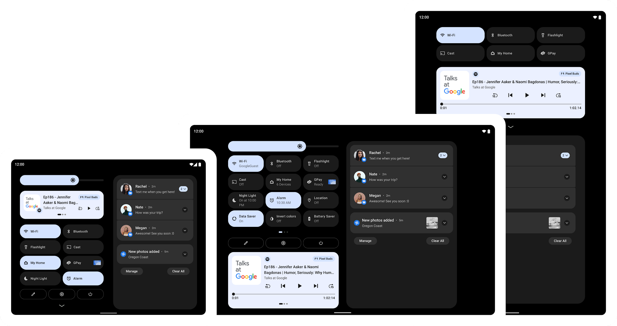
In 12L we’ve refined the UI on large screens across notifications, quick settings, lockscreen, overview, home screen, and more. For example, on screens above 600dp, the notification shade, lockscreen, and other system surfaces use a new two-column layout to take advantage of the screen area. System apps are also optimized.
Two-column layouts show more and are easier to use
We’ve also made multitasking more powerful and intuitive – 12L includes a new taskbar on large screens that lets users instantly switch to favorite apps on the fly. The taskbar also makes split-screen mode more discoverable than ever – just drag-and-drop from the taskbar to run an app in split-screen mode. To make split-screen mode a better experience in Android 12 and later, we’re helping users by automatically enabling all apps to enter split screen mode, regardless whether the apps are resizable.
Drag and drop apps into split-screen mode
Last, we’ve improved compatibility mode with visual and stability improvements to offer a better letterboxing experience for users and help apps look better by default. We’ve made letterboxing easily customizable by device manufacturers, who can now set custom letterbox colors or treatments, adjust the position of the inset window, apply custom rounded corners, and more.
We plan to release the 12L feature drop early next year, in time for the next wave of Android 12 tablets and foldables. We’re already working with our OEM partners to bring these features to their large screen devices – watch for the developer preview of 12L coming soon to the Lenovo P12 Pro. With the features coming to devices in the few months ahead, now is a great time to optimize your apps for large screens.
For developers, we highly recommend checking out how your apps work in split screen mode with windows of various sizes. If you haven’t optimized your app yet, see how it looks in different orientations and try the new compatibility mode changes if they apply. Along with the large screen features, 12L also includes a handful of new APIs for developers, along with a new API level. We’ve been careful not to introduce any breaking changes for your apps, so we won’t require apps to target 12L to meet Google Play requirements.
To get started with 12L, download the 12L Android Emulator system images and tools from the latest preview release of Android Studio. Review the features and changes to learn about areas to test in your apps, and see preview overview for the timeline and release details. You can report issues and requests here, and as always, we appreciate your feedback!
12L is for phones, too, but since most of the new features won’t be visible on smaller screens, for now we’re keeping the focus on tablets, foldables, and ChromeOS devices. Later in the preview we plan to open up Android Beta enrollments for Pixel devices. For details, visit developer.android.com/12L.
Making it easier to build for large screens
It’s time to start designing fully adaptive apps to fit any screen, and now we’re making it even easier. To help you get ready for these changes in the OS and Play, along with the developer preview we’re releasing updates to our APIs, tools and guidance.
Design with large screen patterns in mind
The first step to supporting adaptive UI is designing your app to behave nicely on both a small and a larger screen. We’ve been working on new Material Design guidance that will help you scale your app’s UI across all screens. The guidance covers common layout patterns prevalent in the ecosystem that will help inspire and kick-start your efforts.
Adaptive UI patterns in the Material Design guidelines
Build responsive UIs with new navigation components
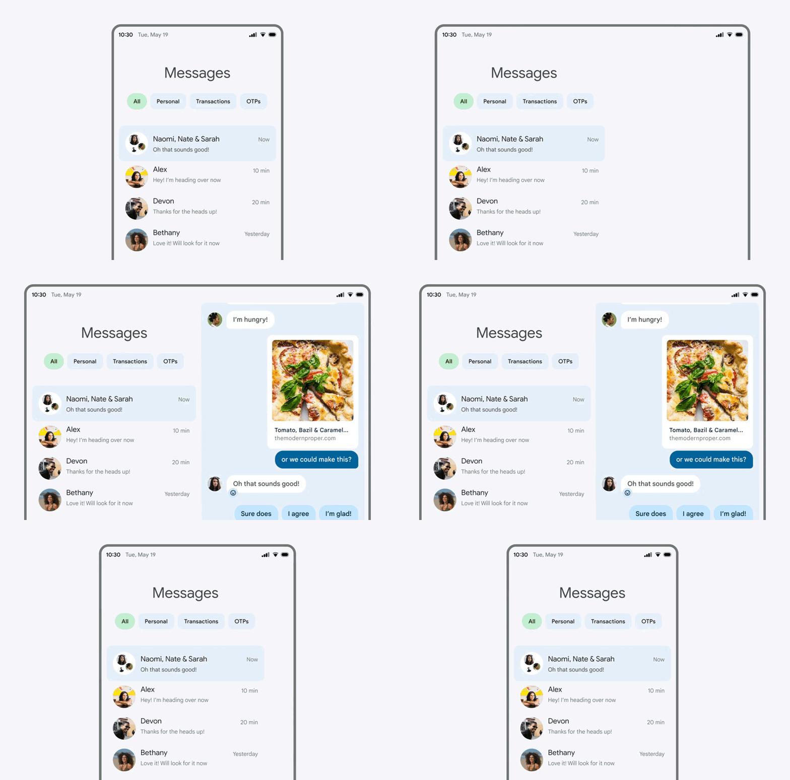
To provide the best possible navigation experience to your users, you should provide a navigation UI that is tailored to the Window Size Class of the user’s device. The recommended navigation patterns include using a navigation bar for compact screens and a navigation rail for medium-width device classes and larger (600dp+). For expanded-width devices, there are several ideas on larger screen layouts within our newly released Material Design guidance such as a List/Detail structure that can be implemented, using SlidingPaneLayout. Check out our guidance on how to implement navigation for adaptive UIs in Views and Compose.
While updating the navigation pattern and using a SlidingPaneLayout is a great way to apply a large screen optimized layout to an existing application with fragments, we know many of you have applications based on multiple activities. For those apps, the new activity embedding APIs released in Jetpack WindowManager 1.0 beta 03 make it easy to support new UI paradigms, such as a TwoPane view. We’re working on updating SlidingPaneLayout to support those APIs – look for an update in the coming months.
Use Compose to make it easier to respond to screen changes
Jetpack Compose makes it easier to build for large screens and diverse layouts. If you’re starting to adopt Compose, it’s a great time to optimize for large screens along the way.
Compose is a declarative UI toolkit; all UI is described in code, and it is easy to make decisions at runtime of how it should adapt to the available size. This makes Compose especially great for developing adaptive UI, as it is very easy to handle UI changes across different screen sizes or components. The Build adaptive layouts in Compose guide covers the basics of what you need to know.
Use WindowManager APIs to build responsive UIs
The Jetpack WindowManger library provides a backward-compatible way to work with windows in your app and build responsive UI for all devices. Here’s what’s new.
Activity embedding
Activity embedding lets you take advantage of the extra display area of large screens by showing multiple activities at once, such as for the List-Detail pattern, and it requires little or no refactoring of your app. You determine how your app displays its activities—side by side or stacked—by creating an XML configuration file or making Jetpack WindowManager API calls. The system handles the rest, determining the presentation based on the configuration you’ve created.
Activity embedding works seamlessly on foldable devices, stacking and unstacking activities as the device folds and unfolds. If your app uses multiple activities, activity embedding can enhance your user experience on large screen devices. Try the activity embedding APIs in Jetpack WindowManager 1.0 Beta 03 and later releases. More here.
Activity embedding with Jetpack WindowManager
Use Window size classes to help detect the size of your window
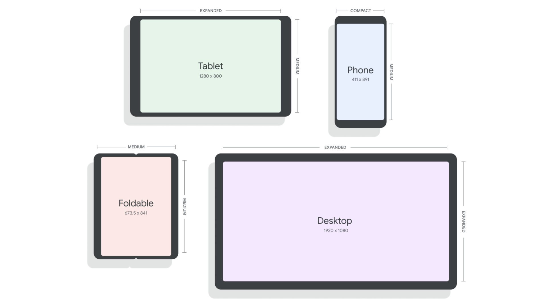
Window Size Classes are a set of opinionated viewport breakpoints for you to design, develop and test resizable application layouts against. The Window Size Class breakpoints have been split into three categories: compact, medium, and expanded. They have been designed specifically to balance layout simplicity with the flexibility to optimize your app for the most unique use cases, while representing a large proportion of devices in the ecosystem. The WindowSizeClass APIs will be coming soon in Jetpack WindowManager 1.1 and will make it easier to build responsive UIs. More here.
Window Size Classes in Jetpack WindowManager
Make your app fold-aware
WindowManager also provides a common API surface for different window features, like folds and hinges. When your app is fold aware, the content in the window can be adapted to avoid folds and hinges, or to take advantage of them and use them as natural separators. Learn how you can make your app fold aware in this guide.
Building and testing for large screens with Android Studio
Reference Devices
Since Android apps should be built to respond and adapt to all devices and categories, we’re introducing Reference Devices across Android Studio in many tools where you design, develop and test UI and layout. The four reference devices represent phones, large foldable inner displays, tablets, and desktops. We’ve designed these after analyzing market data to represent either popular devices or rapidly growing segments. They also enable you to ensure your app works across popular breakpoint combinations with the new WindowSizeClass breakpoints, to ensure your app covers as many use cases as possible.
Reference Device definitions
Layout validation
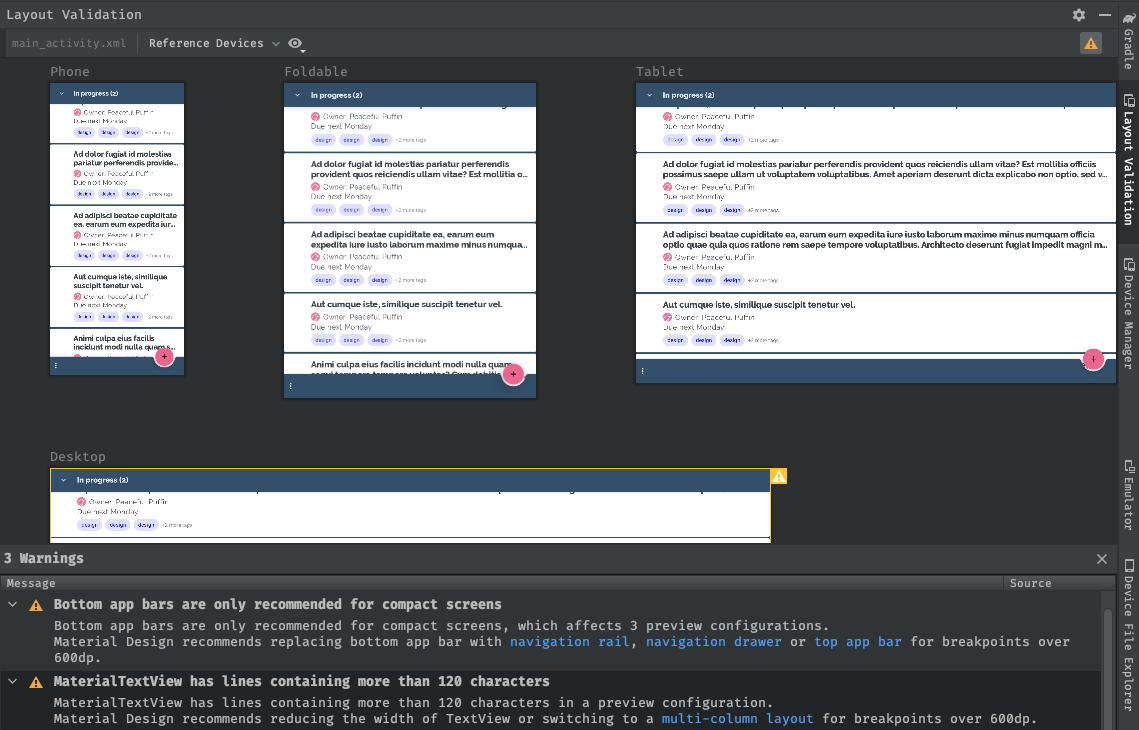
If you’re not sure where to get started adapting your UI for large screens, the first thing you can do is use new tools to identify potential issues impacting large screen devices. In Android Studio Chipmunk, we’re working on a new visual linting tool to proactively surface UI warnings and suggestions in Layout Validation, including which reference devices are impacted.
Layout validation tool with Reference Device classes
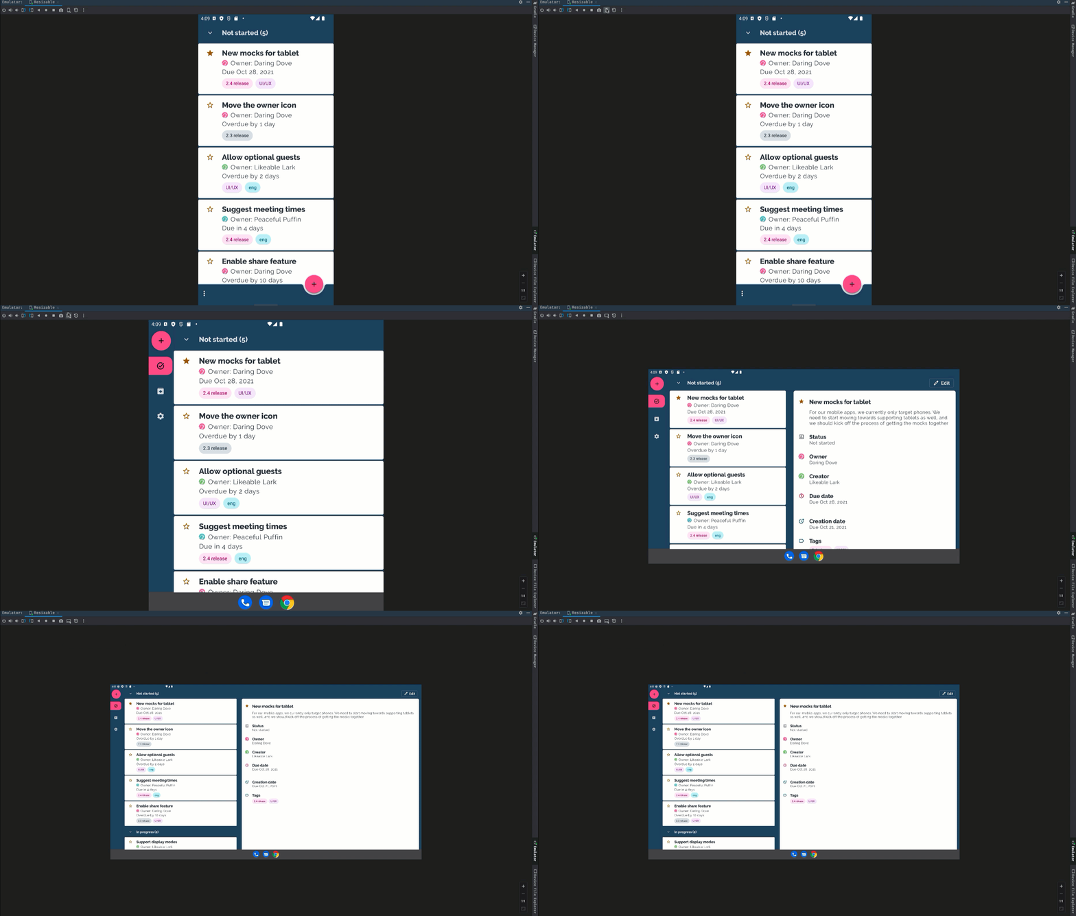
Resizable emulator
To test your app at runtime, we can use the new resizable emulator configuration that comes with Android Studio Chipmunk. The resizable emulator lets you quickly toggle between the four reference devices – phone, foldable, tablet, and desktop. This makes it easier to validate your layout at design time and test the behavior at runtime, both using the same reference devices. To create a new Resizable emulator, use the Device Manager in Android Studio to create a new Virtual Device and select the Resizable device definition with the Android 12L (Sv2) system image.
Resizable Android Emulator
Changes to Google Play on large screens
To make it easier for people to find the best app experiences on their tablets, foldables, and ChromeOS devices, we’re making changes in Play to highlight apps that are optimized for their devices.
We’re adding new checks to assess each app’s quality against our large screen app quality guidelines to ensure that we surface the best possible apps on those devices. For apps that are not optimized for large screens, we’ll start warning large screen users with a notice on the app’s Play Store listing page.
We’ll also be introducing large screen specific app ratings, as announced earlier this year, so users will be able to rate how your app works on their large screen devices. These changes are coming next year, so we’re giving you advanced notice to get your apps ready!
Also, make sure to check out our post that highlights how we are evolving our business model to address developer needs in Google Play.
Learn more!
To help you get started with building for large screens and foldables, no matter whether you’re using Views or Compose, we’ve got you covered! We’re launching new and updated guidance on how to support different screen sizes both in a new and in an existing app, how to implement navigation for both Views and Compose, how to take advantage of foldable devices and more. Check them out in the large screens guides section for Views support or in the Compose guides section.
Nothing speaks louder than code – we updated the following samples to support responsive UIs:
For some hands-on work, check out our Support foldable and dual-screen devices with Jetpack WindowManager updated codelab.
By Dave Burke, VP of Engineering
Source Android Developers Blog
For enquiries, product placements, sponsorships, and collaborations, connect with us at [email protected]. We'd love to hear from you!
Our humans need coffee too! Your support is highly appreciated, thank you!

