In the previous MAD Skills Compose Basics article, you learned about the building blocks of UI in Compose: composable functions. Now, it’s time to learn about the powerful toolkit of UI components that ship with Compose enabling you to build rich UIs and interactions.
If you’ve got any questions so far from this series on Compose Basics, we will have a live Q&A session on October 13th. Leave a comment here, on YouTube, or using #MADCompose on Twitter to ask your questions.
So far we’ve looked at how to build a portion of the single choice question screen in Jetsurvey, one of our Compose samples. Let’s see how we can build the rest of the screen to match our design specs using the Compose toolkit.
From our partners:
You can watch the accompanying video to this article here.
Building with Material Design
Jetpack Compose makes it easy to give your app a consistent look and feel by shipping with an implementation of material design from the start. Material design is an adaptable system of guidelines, components, and tools that support the best practices of user interface design.
Theming
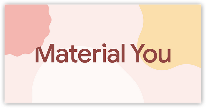
Jetpack Compose supports Material Design 2 and 3. Material 3 is the next evolution of Material design featuring updated components and “Material You” customization features designed to match the new visual look and feel on Android 12 and above. With Material Design, your app can be themed to match your brand by providing custom colors, typography, and shapes all in one place.
Jetsurvey uses material theming to style the whole app. The Theme.kt file defines a composable function called JetsurveyTheme which uses the MaterialTheme composable function to provide custom values for colors, shapes, and typography.
// Copyright 2022 Google LLC.
// SPDX-License-Identifier: Apache-2.0

private val LightColors = lightColorScheme(
    primary = md_theme_light_primary,
    // …
)

private val DarkColors = darkColorScheme(
    primary = md_theme_dark_primary,
    // …
)

@Composable
fun JetsurveyTheme(
    useDarkTheme: Boolean = isSystemInDarkTheme(),
    content: @Composable () -> Unit
) {
    val colors = if (!useDarkTheme) {
        LightColors
    } else {
        DarkColors
    }
    // …
    MaterialTheme(
        colorScheme = colors,
        shapes = Shapes,
        typography = Typography,
        content = content,
    )
}
To ensure that the color scheme of the app responds automatically when the system theme is changed by the user, different colors are used in the theme, depending on the system appearance: light or dark.
Custom fonts and styles like weight, size, and line height are set in the Typography.kt file. To style text, callers can reference the typography property of MaterialTheme (e.g. MaterialTheme.typography.titleMedium), rather than defining text styles at the call site, which allows text to appear and be styled consistently.
// Copyright 2022 Google LLC.
// SPDX-License-Identifier: Apache-2.0

val MontserratFontFamily = FontFamily(
    listOf(
        Font(R.font.montserrat_regular),
        Font(R.font.montserrat_medium, FontWeight.Medium),
        Font(R.font.montserrat_semibold, FontWeight.SemiBold)
    )
)

val Typography = Typography(
    // Display Large - Montserrat 57/64 . -0.25px
    displayLarge = TextStyle(
        fontFamily = MontserratFontFamily,
        fontWeight = FontWeight.W400,
        fontSize = 57.sp,
        lineHeight = 64.sp,
        letterSpacing = (-0.25).sp,
    ),

    // Display Medium - Montserrat 45/52 . 0px
    displayMedium = TextStyle(
        fontFamily = MontserratFontFamily,
        fontWeight = FontWeight.W400,
        fontSize = 45.sp,
        lineHeight = 52.sp,
        letterSpacing = 0.sp,
    ),
    // …
)
Custom shapes are also configured in Shape.kt to allow customization of rounded corners for different sizes of shapes in the app.
// Copyright 2022 Google LLC.
// SPDX-License-Identifier: Apache-2.0

val Shapes = Shapes(
    extraSmall = RoundedCornerShape(12.dp),
    small = RoundedCornerShape(12.dp),
)
To learn more about theming, check out Material Theming in Compose.
Scaffold
Scaffold is a fundamental Material Design component that is part of the toolkit. It is a basic layout for arranging Material components in common screen patterns, such as a screen with a SmallTopAppBar, and FloatingActionButton.
// Copyright 2022 Google LLC.
// SPDX-License-Identifier: Apache-2.0

Scaffold(
  topBar = {
      SmallTopAppBar(/* ... */)
  },
  floatingActionButtonPosition =
    FabPosition.End,
  floatingActionButton = {
      FloatingActionButton(/* ... */)
  },
  content = { /* ... */ }
)
The above snippet will render a screen containing a top app bar, a floating action button, and an area to display content (currently displaying an empty area).
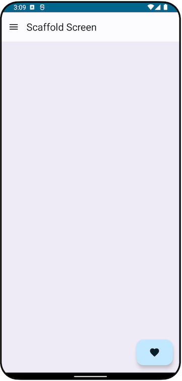
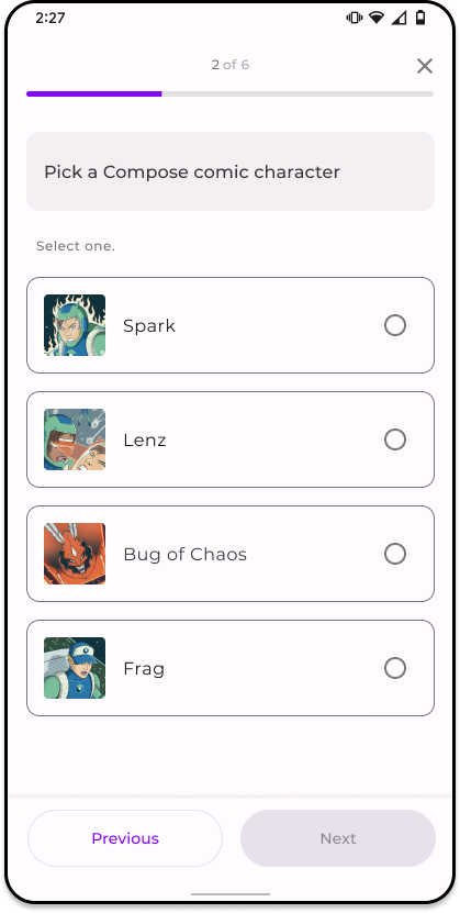
Does this look familiar? The survey screen from Jetsurvey also conforms to Scaffold:
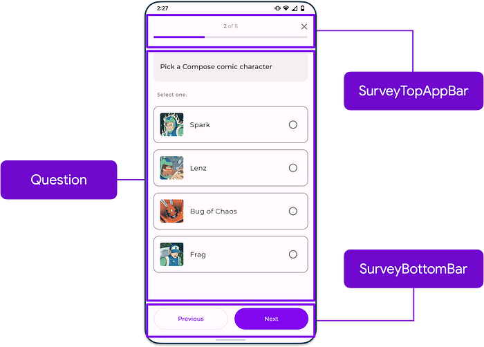
If you want to see how this is implemented, check out the SurveyQuestionsScreen composable function in the SurveyScreen.kt file.
While having a top/bottom app bar and floating action button are common uses for Scaffold, it supports other configurations as well such as hosting a Navigation drawer or Scackbar. To learn more, check out the Scaffold reference docs.
Surface and more components
Another fundamental component in Material Design is the concept of a Surface. A Surface is a central metaphor in Material Design which content sits on. Surfaces can wrap your composables so that you can customize their background color, shape, border, as well as tonal and shadow elevation.
Apart from Surface, chances are you’re going to need a lot more components to build any kind of UI you can think of. This is why Compose provides a bunch of other Material Design components out-of-the-box like:
- Top and bottom app bars
- Buttons
- Cards
- Switches
- Chips
- Dividers
- Floating action buttons
- …and a whole lot more
Accessibility
Understanding and building in ways that cater to the diverse needs of your users can be a challenge. To help with this, Material 3 components are also all accessible by default, featuring acceptable color contrast ratios, a minimum touch size, and more.
…and that’s only scratching the surface on material design! You can check out the Compose Material 3 API reference, and the Material Design 3 website to learn more.
Layouts
We’ve looked at how to arrange components on a single answer in the survey by using the Row composable function. But how do we arrange all the different components for the rest of the screen? We do that by using layouts!
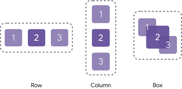
Compose has 3 standard layout elements. As we’ve seen previously, to horizontally arrange items, we can wrap our UI components in a Row composable function. To vertically arrange items, we can use the Column composable function. On the other hand, if we wanted to put or stack elements on top of another, we could use the Box composable.
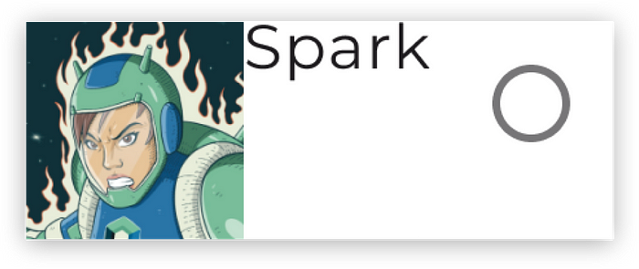
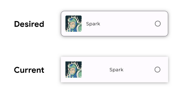
These standard layouts also accept parameters so you can further control how items are placed. Taking the implementation we saw previously of SurveyAnswer (calling Row without configuring it), if we try to run this, an answer in the survey would actually look something like this:
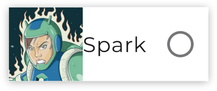
To change that, let’s pass in some additional parameters to the Row composable function.
The vertical alignment of items in the Row can be changed via the verticalAlignment parameter. Since we want items to be centered vertically, let’s pass Alignment.CenterVertically as its value. Furthermore, we’ll also want to change the horizontal arrangement of items so that they are spaced evenly across the Row without free space before the Image and the RadioButton using Arrangement.SpaceBetween as the value. We won’t see much of an effect yet with this change, but we’ll see why this matters in a bit.
Our code should now look something like this:
// Copyright 2022 Google LLC.
// SPDX-License-Identifier: Apache-2.0

@Composable
fun SurveyAnswer(answer: Answer) {
  Row(
    verticalAlignment = Alignment.CenterVertically,
    horizontalArrangement = Arrangement.SpaceBetween
  ) {
    Image(answer.image)
    Text(answer.text)
    RadioButton(false, onClick = { /* … */ })
  }
}
…and the resulting UI:
There’s so much more to layouts so make sure to check out the documentation pages about layouts to learn more.
Modifiers
So far, we’ve covered styling, components, and layouts. But how do we control things like sizes, padding, and other appearances?
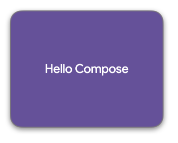
You do that by using modifiers! Modifiers allow you to decorate or augment a composable. Every composable function in the compose toolkit accepts a Modifier as a parameter. Modifiers can be chained together until you achieve your desired customization.
Modifiers allow you to do all sorts of things like set a background color, change the size, add padding, change the alpha of the element, and even process click inputs from the user.
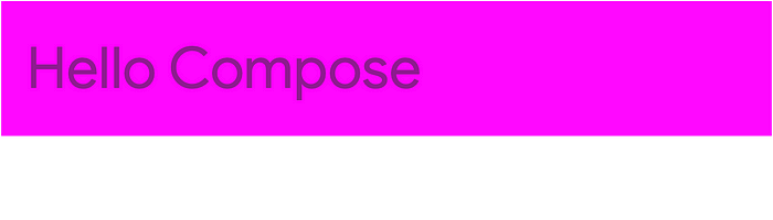
// Copyright 2022 Google LLC.
// SPDX-License-Identifier: Apache-2.0

Text(
  "Hello Compose!",
  Modifier.background(Color.Magenta)
    .size(200.dp, 30.dp)
    .padding(5.dp)
    .alpha(0.5f)
    .clickable {
      // Called when Text clicked
    }
)
Additional modifiers might also be available to you depending on the scope of a composable function.
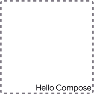
For instance, if you are within the scope of a Box, the align modifier allows you to position an element relative to the containing Box. The code snippet below shows changing the alignment of the Text element to be BottomEnd so that it aligns to the bottom right corner of the Box. This modifier wouldn’t be accessible outside of the Box composable and its scope, making modifiers type safe.
// Copyright 2022 Google LLC.
// SPDX-License-Identifier: Apache-2.0

Box(Modifier.size(150.dp)) {
  Text(
    "Hello Compose!",
    Modifier.align(
      Alignment.BottomEnd
    )
  )
}
Updating SurveyAnswer with Modifiers
Using modifiers, we can further customize the SurveyAnswer composable to match our designs. Let’s also assume here that this composable is called within our app’s theme so that the typography, shapes, and colors match our brand.
First, let’s further customize the Row by passing in a Modifier. Since we want the item to occupy the maximum allotted horizontal space, let’s call fillMaxWidth. Also, since we want 16 dp of padding around the container, let’s chain a padding modifier as well.
// Copyright 2022 Google LLC.
// SPDX-License-Identifier: Apache-2.0

@Composable
fun SurveyAnswer(answer: Answer) {
  Row(
    Modifier.fillMaxWidth().padding(16.dp),
    verticalAlignment = Alignment.CenterVertically,
    horizontalArrangement = Arrangement.SpaceBetween
  ) {
    Image(answer.image)
    Text(answer.text)
    RadioButton(/* ... */)
  }
}
With these modifications, our survey answer is looking a lot closer to our desired output. Notice that the Text’s width occupies the available space between the Image and RadioButton thanks to the Arrangement.SpaceBetween value we passed in for the horizontalArrangement value for the Row.
To add a border and adjust the corners of the answer we’ll need to wrap the Row around a Surface composable. Doing so, we can configure the shape, border color and stroke size. With the following changes, we should now see the answer match our desired output.
// Copyright 2022 Google LLC.
// SPDX-License-Identifier: Apache-2.0

@Composable
fun SurveyAnswer(answer: Answer) {
  Surface(
   border = BorderStroke(
     1.dp,
     MaterialTheme.colorScheme.outline
  ),
   shape = MaterialTheme.shapes.small
  ) {
    Row(
      Modifier.fillMaxWidth().padding(16.dp),
      verticalAlignment = Alignment.CenterVertically,
      horizontalArrangement = Arrangement.SpaceBetween
    ) {
      Image(answer.image)
      Text(answer.text)
      RadioButton(/* ... */)
    }
  }
}
We’ve only covered a few modifiers and there are a bunch more that you can use to decorate your composable functions so make sure to check out the documentation page on modifiers to learn more.
Summary
We covered a lot! In the article, we were able to build a simple screen using Material theme and the Material components provided out of the box. We also saw how we can lay out composables using Row, Column, and Box, and how to build that pixel perfect UI with modifiers.
In the next article, we’ll cover Compose tooling and show how these tools can help accelerate your development.
Got any questions? Leave a comment below or use the #MADCompose hashtag on Twitter and we will address your questions in our upcoming live Q&A for the series on October 13. Stay tuned!
By Chris Arriola
Source Medium
For enquiries, product placements, sponsorships, and collaborations, connect with us at [email protected]. We'd love to hear from you!
Our humans need coffee too! Your support is highly appreciated, thank you!