Compose allows you to build beautiful UIs quickly. Together with the Android Studio tooling support, you’re able to accelerate the development process even further with faster iteration and better debugging.
So far we’ve looked at how to implement a single answer option in Jetsurvey, one of our Compose samples (previous article). Let’s see how Android Studio can help us write this efficiently.
From our partners:
If you’ve got any questions so far from this series on Compose Basics, we will have a live Q&A session on October 13th. Leave a comment here, on YouTube, or using #MADCompose on Twitter to ask your questions.
You can also watch the accompanying video to this article here:
Live Templates
When building composable elements for your app, you might find yourself frequently typing:
// Copyright 2022 Google LLC.
// SPDX-License-Identifier: Apache-2.0

@Composable
fun SurveyAnswer() {
  // ...
}
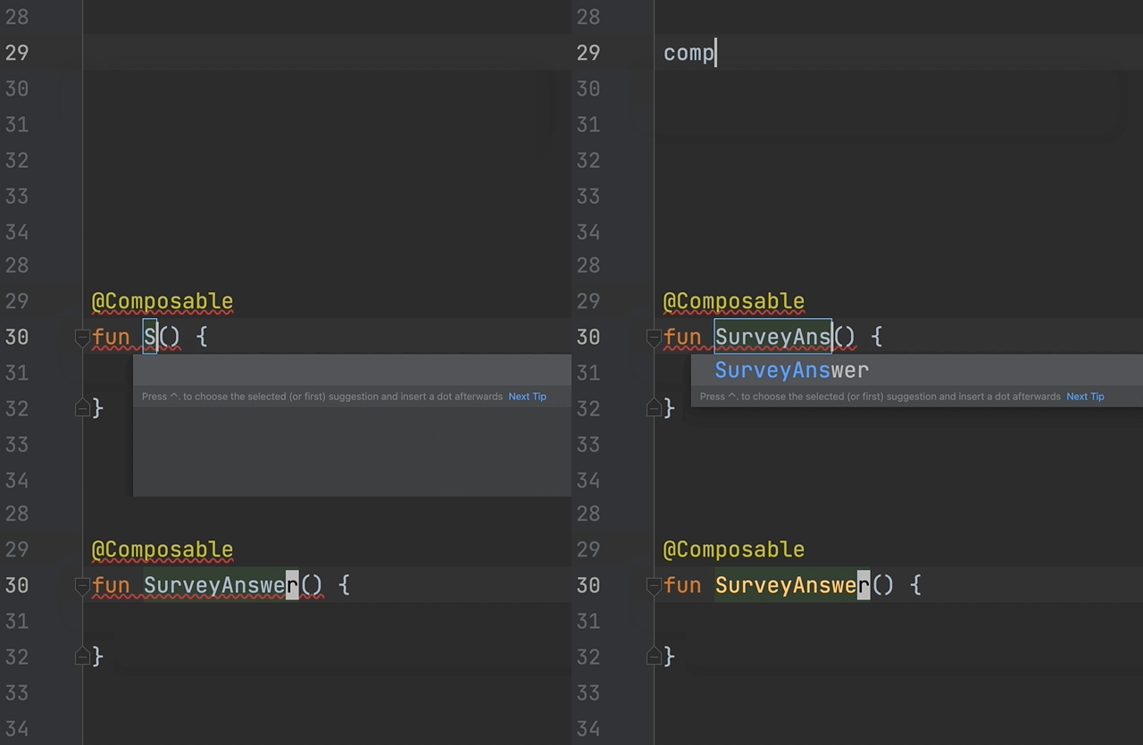
To help save on keystrokes, live templates allow you to insert common code snippets by typing an abbreviation. To insert the above code snippet, simply type “comp” followed by hitting the tab or return key to insert a composable function. From there, you can enter the name of the function, and you’re done 🏃♂️💨
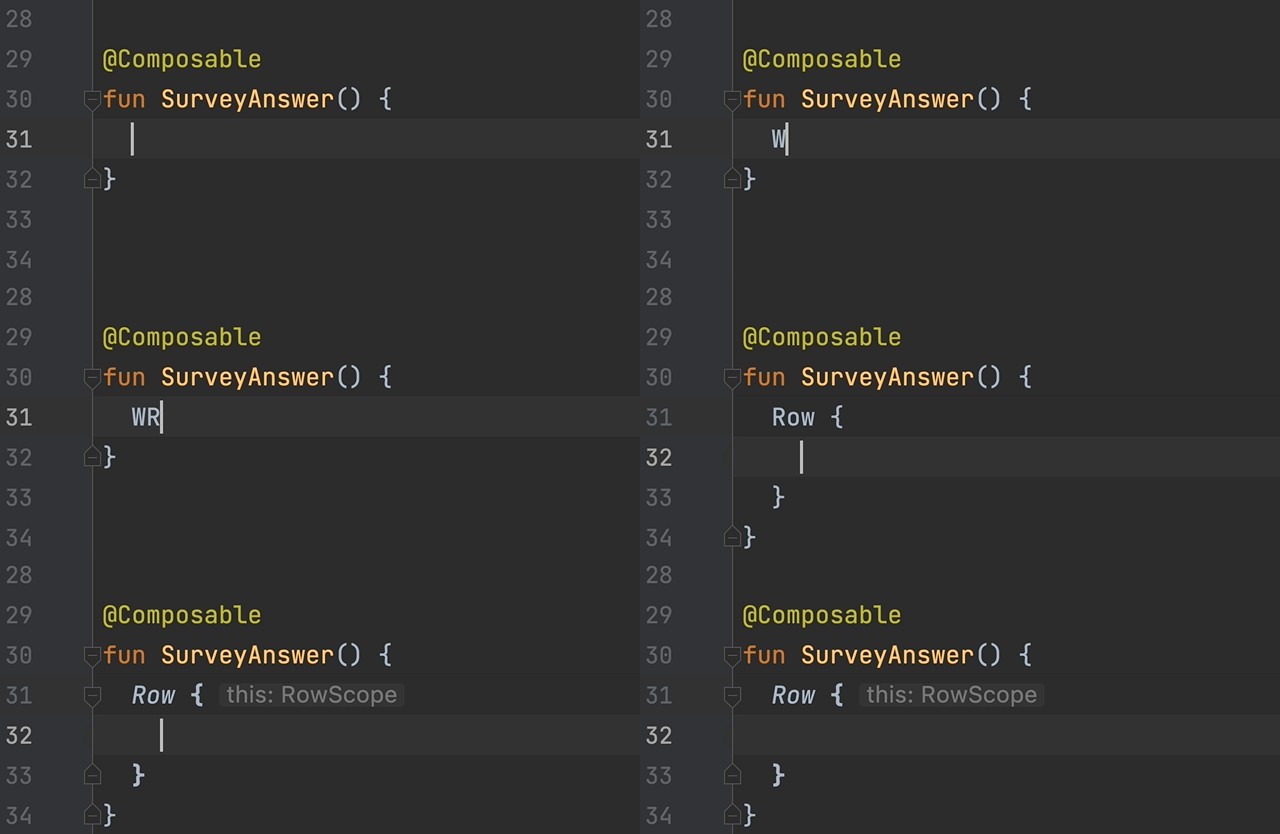
You can also wrap the current composable with a Box (or another widget), Row, or Column by using the “W”, “WR”, or “WC” abbreviation, respectively. Since we want a Row in SurveyAnswer, we’ll use the “WR” abbreviation to generate it.
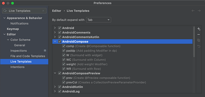
To see the full list of Compose-related live templates, navigate to your Android Studio’s preferences.
Gutter icons
The first element within the Row is an Image composable. In the snippet below, we are using the painterResource API to fetch a resource drawable named “lenz” to be displayed in the Image.
// Copyright 2022 Google LLC.
// SPDX-License-Identifier: Apache-2.0

@Composable
fun SurveyAnswer() {
    Image(painterResource(id = R.drawable.lenz), contentDescription = "")
}
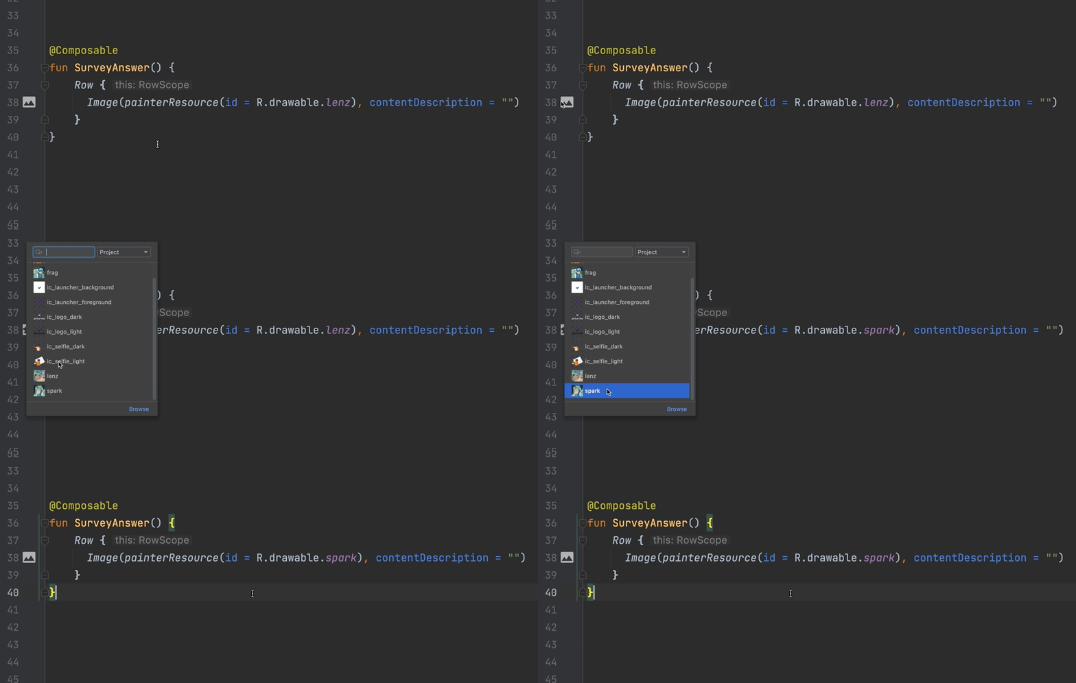
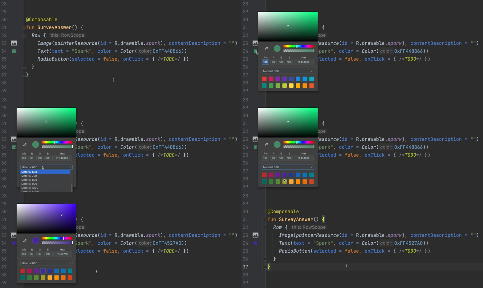
One of the challenges when working with drawables is that it’s hard to know what the drawable looks like. To help with this, Android Studio shows an icon in the gutter of the editor making it quick and easy to switch to another image. Let’s go ahead and switch the image to display “Spark”.
Next, let’s implement the Text in the Row and give it a custom color. Let’s also implement the RadioButton and set it as unselected.
// Copyright 2022 Google LLC.
// SPDX-License-Identifier: Apache-2.0

@Composable
fun SurveyAnswer() {
  Row {
    Image(painterResource(id = R.drawable.spark), contentDescription = "")
    Text(text = "Spark", color = Color(0xFF448866))
    RadioButton(selected = false, onClick = { /* … */ })
  }
}
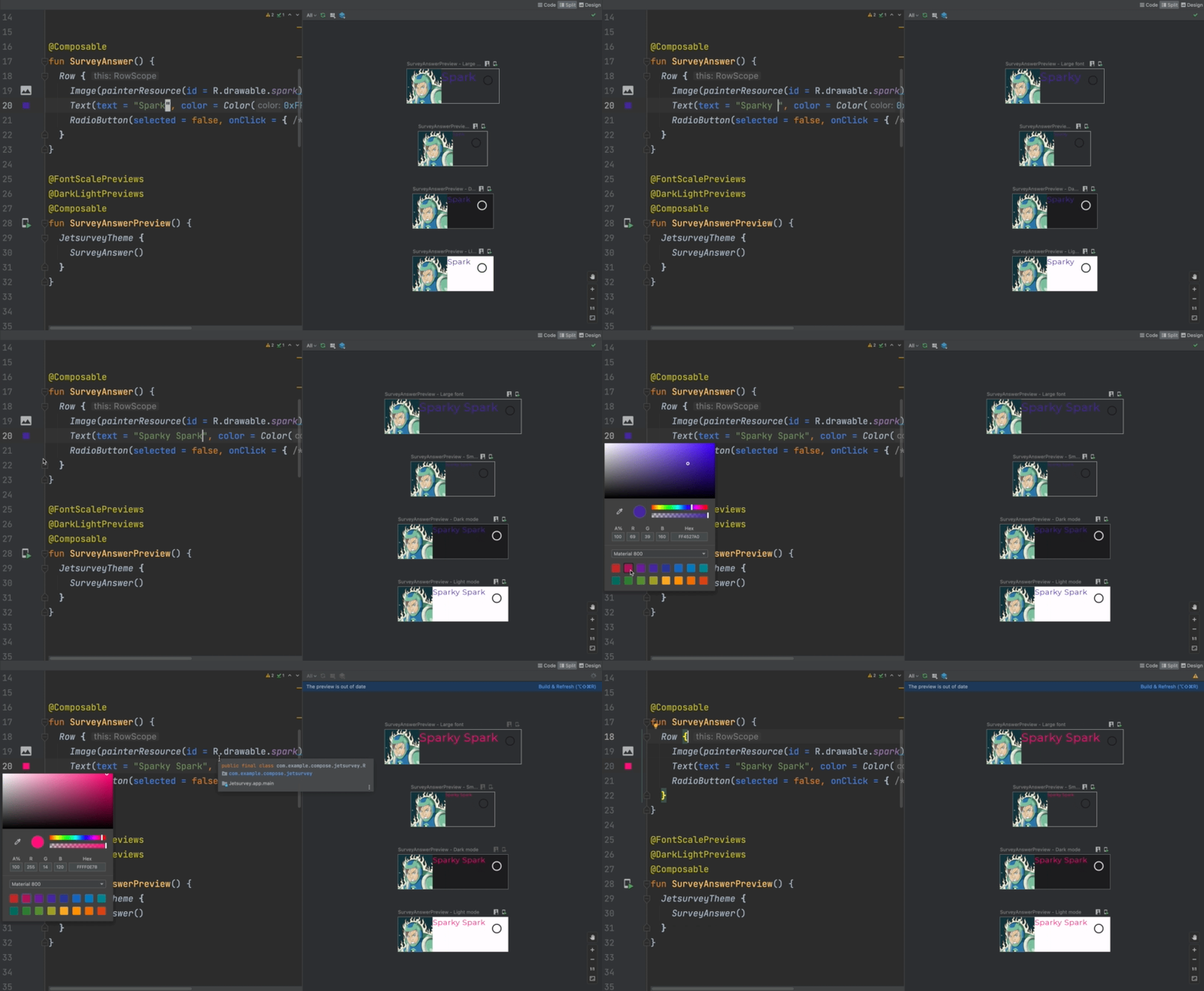
The color should also show up in the editor’s gutter. Clicking it gives us a color picker that we can use to quickly change the color. You can enter RGB, Hex, or easily pick colors out of the material color palette.
Composable Preview
With our basic composable function, it’s time to see how this composable actually looks! It would be great to be able to see our composable while we work on it, without having to run the whole app on a device. This is made easy by creating a composable preview.
Using live templates, you can type “prev” followed by pressing tab or return. Doing this will generate a composable function with an extra @Preview annotation. Let’s call it SurveyAnswerPreview, invoke the SurveyAnswer composable wrapped within our app’s custom theme.
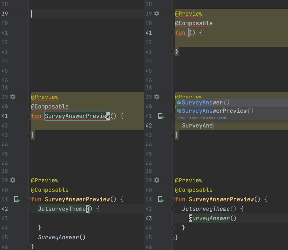
The @Preview annotation tells Android Studio that this composable should be shown in the design view of this file. Tapping the ‘Split’ icon at the top of the editor and clicking ‘Build & Refresh’ should then show the SurveyAnswerPreview composable!

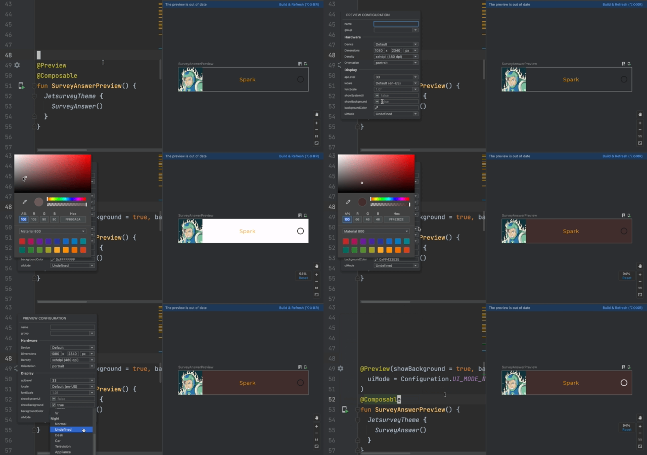
The @Preview annotation should also have a gutter icon (⚙️) where we can specify all kinds of properties for the preview. For example, we can show the preview with a certain background color in night mode.
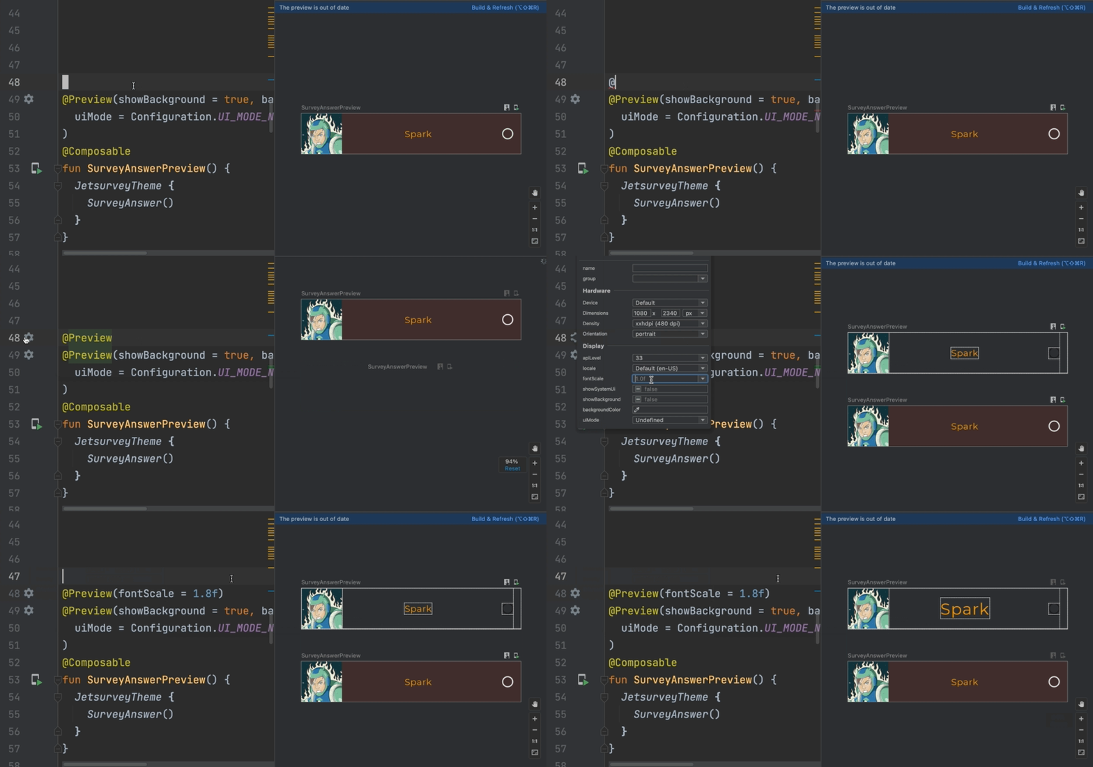
You can add the @Preview annotation to the same function multiple times to preview a composable with different properties. For example, we can add another preview that shows SurveyAnswer with an extra large font.
Multipreview
Oftentimes, you’ll want to see how your composables look in different configurations — in light or dark mode, in different font sizes, and so on. With the multipreview feature, you can define an annotation class that itself has multiple preview annotations associated with it.
For example, we can define a FontScalePreviews annotation class that has two @Preview annotations for previewing a composable at different font scales, and a DarkLightPreviews annotation class that previews a composable in both light and dark mode.
// Copyright 2022 Google LLC.
// SPDX-License-Identifier: Apache-2.0

@Preview(
    name = "Small font",
    group = "Font scales",
    fontScale = 0.5f
)
@Preview(
    name = "Large font",
    group = "Font scales",
    fontScale = 1.5f
)
annotation class FontScalePreviews

@Preview(
    name = "Dark mode",
    group = "UI mode",
    uiMode = Configuration.UI_MODE_NIGHT_YES or Configuration.UI_MODE_TYPE_NORMAL,
    showBackground = true
)
@Preview(
    name = "Light mode",
    group = "UI mode",
    uiMode = Configuration.UI_MODE_NIGHT_NO or Configuration.UI_MODE_TYPE_NORMAL,
    showBackground = true
)
annotation class DarkLightPreviews
To view these previews, simply annotate your preview composables with your newly created annotation classes.
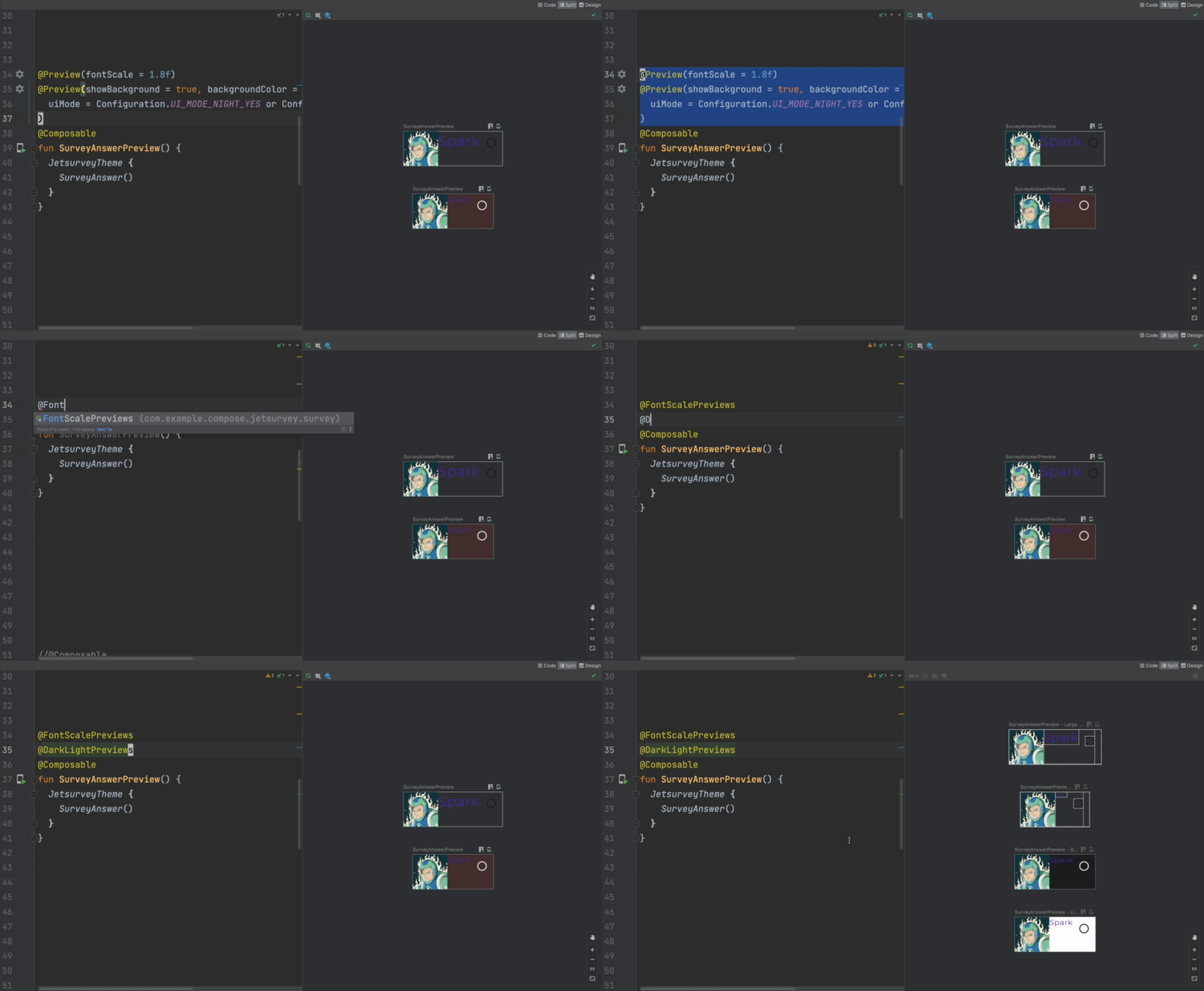
You can mix and match multipreviews in a way that fits your project. Larger projects might benefit from defining a multipreview annotation for each customisation vector (e.g. @FontScalePreviews, @DarkLightPreviews), combining those into use-case based multipreviews (e.g. @DesignComponentPreviews or @ScreenPreviews) and annotating preview composables with the most relevant one.
Preview on device
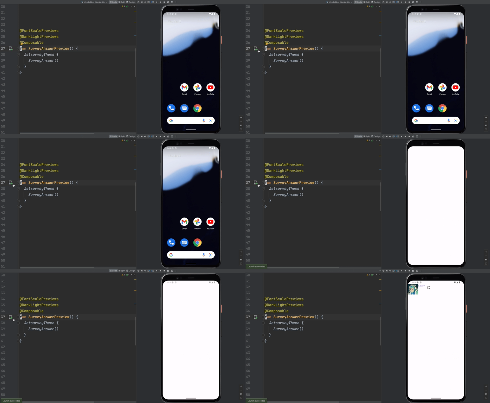
In addition to viewing previews in Android Studio, you can also deploy your previews directly to an emulator or device. To do so, you can use the run icon in the editor’s gutter. Instead of following the preview’s configuration parameters, this will use the configuration of the device being deployed to.
Live edit of literals
When you update a composable, typically you have to build & refresh the preview or redeploy to the device to see your changes. With Live edit of literals, rebuilding isn’t necessary for certain constant literals like integers, strings, and colors. For example, if we update the name of our super hero, we see the changes being updated immediately. Similarly, we can change the color of the text without needing to rebuild.
Live Edit
Live Edit takes this behavior even further and lets you change the contents of a composable without needing to rebuild. Working on our SurveyAnswer, we can add modifiers, properties, or even remove or add child composables. All these changes are automatically reflected on your device.
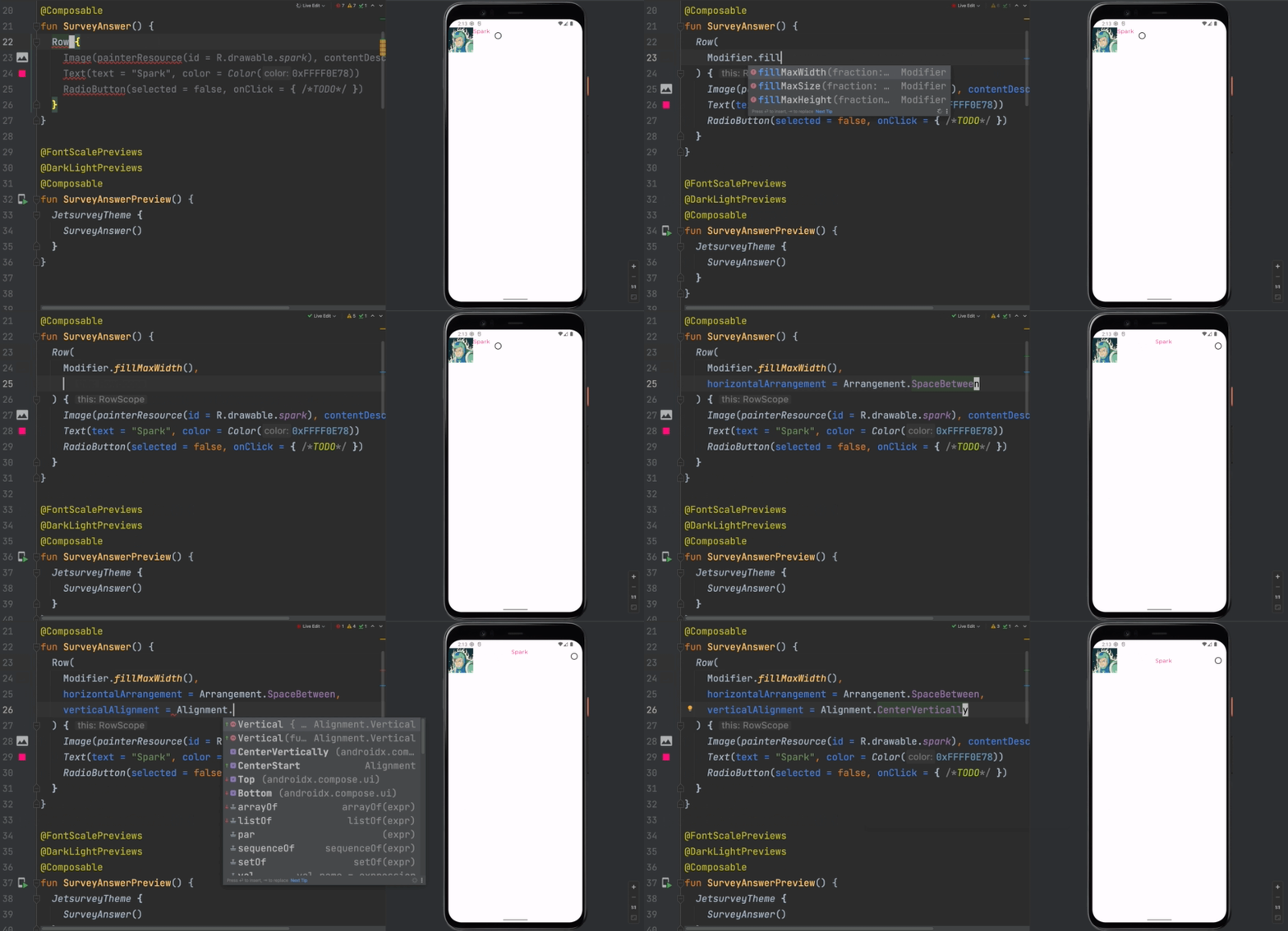
Live Edit is a new experimental feature, so right now it’s not available by default. Read the documentation to learn how you can enable it for your project.
Layout Inspector
With previews, multipreview, live edit of literals, and live edit, iterating on your design is a breeze. But, what if there’s something wrong with your composable, and you need to debug it? Android Studio allows you to dig deeper so you can figure out what’s wrong with the Layout Inspector.
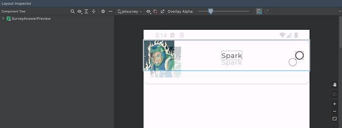
The Layout Inspector allows you to explore all the nodes in the UI hierarchy. Highlighting an element also shows you all the attributes set for a particular element. For example, highlighting the RadioButton in our composable shows which line in our code implements the onClick handler which is quite useful when debugging.

The Layout Inspector also allows you to overlay an image on top of the layout to verify if your implementation is pixel perfect. In our case, we can see that there’s still some work to be done.
Summary
That covers a lot of the helpful tooling provided by Android Studio to help us develop apps much faster in Compose.
To summarize:
- With Live templates, we can insert common code snippets much faster using abbreviations
- Contextual Gutter icons allow us to quickly change things like images and colors
- The
@Previewannotation allows us to see our composables without having to deploy the entire app to a device - Both the live edit of literals and live edit allow us to see code updates in real time
Got any questions? Leave a comment below or use the #MADCompose hashtag on Twitter and we will address your questions in our upcoming live Q&A for the series on October 13. Stay tuned!
By Chris Arriola
Source Medium
For enquiries, product placements, sponsorships, and collaborations, connect with us at [email protected]. We'd love to hear from you!
Our humans need coffee too! Your support is highly appreciated, thank you!


